
A buyer scrolls through listings, then they stop and click on one. Why? It’s not the price, it’s not the square footage, it’s the way the listing looks. Before a buyer reads a signal detail, they’ve already made a quick judgment based on what they saw first. And that first impression can either pull them in or push them away.
Buyers are scrolling fast because there’s a lot to choose from. You already know how competitive and saturated the market is and really, you only have a few seconds to catch a buyer’s attention. If your listing doesn’t stand out, they skip it and move on. While the way you present the home in person matters, how you present it online matters, too, because that’s the actual first impression you make.
And you can’t just hire a photographer and hope the photos come out good. You have to know what to lead with, how to guide the eye through the listing, and which details make or break a buyer’s interest.
Keep reading and you’ll learn all about it!

The Importance of Visual Hierarchy
When a potential buyer lands on a real estate listing, it’s not like their eyes just wander randomly across the page. There’s a pattern they follow, which is why visual hierarchy is so important.
Visual hierarchy is the natural order in which people notice things on a screen. The elements that grab attention first are the ones that matter the most, and if the order is off, you’ll probably lose the viewer before they’ve even seen what makes the property special. On listing platforms, this means things like thumbnail photos, bold listing titles, and clearly displayed prices all have to be placed where the eye goes first.
Buyers have a tendency to scan the main image first, and then they’ll glance at the title, price, location, and how many bedrooms and bathrooms there are. If those pieces of information are hard to find, the listing gets skipped.
If you want to keep people engaged, you should lead with the best photo. That’s usually a bright, open shot of the kitchen or the living space. The layout should be clean and simple. Key details should be easy to find without scrolling. Avoid clutter or long-winded descriptions that make the page cluttered and heavy.
The way buyers scan a listing is usually in a rough F-shape pattern; they start at the top left, move across, then down. This means that the top left should have your strongest visuals and key info. Also, buyers like trust signals like verified badges or consistent branding and it will encourage them to stick around.
How to Use Listing Photos to Capture Attention
Photos are the first thing buyers notice and it’s usually the only thing they care about in those first few seconds. This is also why build quality matters.
Properties that’ve been professionally built or renovated look much better both in person and in photos. So make sure that you hire a licensed professional to do any modifications/renovations when you’re giving the property a ‘facelift’.
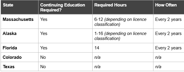
As you can see from the few examples above, in Massachusetts, in order to get a valid license, the construction supervisor has to stay current on MA CSL continuing education prior to each renewal to help ensure high standards during builds and renovations (which are prone to change depending on advancements in technology/safety standards).
But in states like Colorado and Texas, there are no statewide licensing requirements for general contractors or supervisors, which leads to differences in standards (and possibly quality).
Here’s what else matters.
1. Choose the Right Lead Image
The first photo in your listing sets the tone for everything else, so lead with your strongest space. That’s usually a bright, welcoming shot of the kitchen or living room because these areas give the best sense of flow and style.
Don’t start with shots of the exterior unless the curb appeal is a real standout. A front lawn in winter or a driveway with parked cars won’t get you many clicks.
2. Use Consistent Lighting and Angles
Consistent lighting and angles make the photos feel professional and cohesive. Stick with daylight shots and use as much natural light as possible. Also, photograph each room from similar angles to help the viewers get a better sense of the home’s layout.
3. Avoid Common Mistakes
There are a few mistakes many people make that turn buyers off right away. Overusing photo filters is one of them because it makes it look like you’re hiding something. Poor staging is another no-no because nobody wants clutter on counters or personal items in view.
There’s also the photo order to think about; don’t just jump from the bathroom to the kitchen to a hallway. It’s confusing and messy. Instead, show the house in the order someone would walk through it.
Conclusion
With an online listing, you only get one shot at making a first impression and that almost always starts with what the buyers see, not what they read. Basically, everything has to work together – visual hierarchy, being strategic with which photos to post, clear presentation, good angles, lots of natural light…
It all matters, but once you get the hang of it, you’ll get more clicks than ever.